While stories are an effective way to deliver a message, they’re frequently overlooked when creating business strategies. So, let’s walk through an exercise to see how the StoryHow™ Method can support a common B2B situation: the long sales cycle.
FADE IN:
Our scene opens with ACME Cloud, a SaaS company which has invested six months of pre-sales effort into a $10 million deal. Its prospect, PowerWidget, Inc., has just completed a two-month product evaluation and it’s now time for ACME to wrap-up the deal with a day-long presentation at its spiffy new Executive Briefing Center.
Stories consist of three elements: roles, events, and influences. Therefore, if we use them to describe the upcoming executive briefing meeting, we have:
Events:
A presentation-filled day at ACME’s corporate headquarters
Roles:
PowerWidget will bring a team consisting of:
VP Operations
Department Manager
End users
IT Support Specialist
ACME Cloud will parade a steady stream of presenters:
CEO
VP Sales
Account manager
Corporate Marketing
Product Marketing Manager
Pre-sales Engineers
Customer Support Manager
Influences:
PowerWidget:
The SVP Operations wants the best financial terms
The Department Manager wants a solution that is supported by the end users
The end users want a solution that makes their jobs easier, not harder
IT cares about integration with their present environment and access to timely support if something goes wrong
ACME Cloud:
The CEO wants to please shareholders and the board of directors
The VP Sales wants a strategic win to leverage for a bigger prospect
The Account Manager wants account control
The Pre-sales Engineers want the right technical solution
Corporate Marketing wants all messages to be compliant with the corporate brand
Product Marketing wants to position its product
Customer support is measured as a cost center, therefore, the manager is incented to find customers that require minimal support.
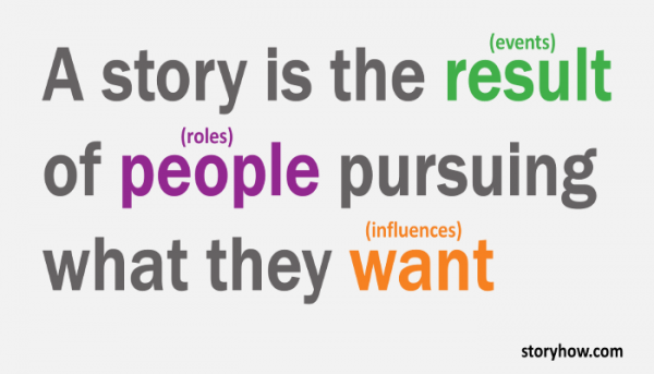
A story is the resultof peoplepursuing what they want. Business stories (sales, support, negotiation, marketing, human resources) are no different. By breaking this common B2B sales situation into the StoryHow™ elements, it’s easy to identify potential conflicts fueled by a dozen characters with disparate motivations.
So, how does ACME deal with these competing motivations? It focuses on the ones that affect the sale.
PowerWidget wants a solution that works from both a technical and financial perspective, is supported by the end users, and can be fixed quickly if something goes wrong.
ACME wants to sell its solution to them
Any message that deviates from these wants must be eliminated from the executive presentation. Period. In storytelling, we call this editing. In business, we call it strategy. ACME must vet each idea, word, sentence, and presentation slide to ensure alignment with PowerWidget’s needs. Failure to focus on the customer’s wants will dilute the message, weaken the strategy, and delay the purchase order–or worse–kill it.
Pruning an executive briefing presentation requires difficult conversations. Does the CEO’s canned-pitch support any of PowerWidget’s needs to make a decision? Will brand messages advance the sale or just add unnecessary filler to an already long meeting? Does PowerWidget care how much market share ACME has? The answers may be yes or no, but is ACME asking the questions at all?
Give it a try. Use story structure to form your next business strategy.
Identify the StoryHow™ elements (roles, events and influences) of your business situation.
Eliminate any messages that don’t align with customer motivations.
Weave the remaining customer-relevant messages into a coherent presentation arc.
I can’t predict the outcome, but I promise that your audience will appreciate the effort.
In last week’s post, How to Tell a Story with Data: Part 1, we used lessons from Cole Nussbaumer Knaflic’s book, Storytelling With Data to correct mistakes made while creating a stacked bar graph. This week, we’ll study the effectiveness of pie charts.
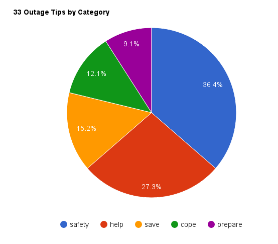
One of the things that struck me about SDG&E’s tweets When the Lights Went Out was the company’s preoccupation with consumer safety. For example, some of SDG&E’s safety tips included flashlight recommendations over candles, using caution while driving through dark intersections, and even checking in with elderly neighbors. I decided to tell this story by comparing the total number of tips through this pie chart.
Figure 1: Original Chart
The problems with this chart seem obvious after reading Storytelling with Data. The first thing that we notice is that although SDG&E’s safety tips consume 36% of the pie chart’s area, the story doesn’t jump off the page. So, I implemented Knaflic’s “remove the clutter” technique to make the story more conspicuous.
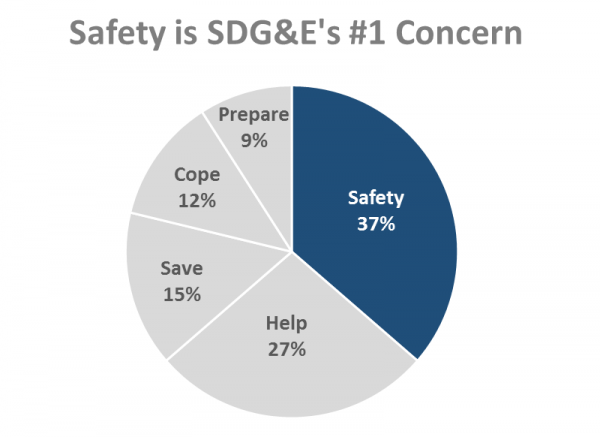
Figure 2: Better, but…
While the chart is better, it also presents us with a good news-bad news situation. The good news is that SDG&E’s safety tips now pop. The bad news is that the chart still fails to tell my “preoccupied with safety” story as the safety tips appear to play a minor role instead of a major one. So, what’s going on?
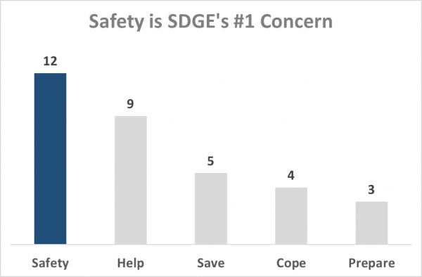
Knaflic identifies a fatal flaw with using pie charts–the fact that our brains distort the data that they represent. Because of this phenomenon, she recommends that we always present data linearly. Take a look at what happens when we present the same data from Figure 2 linearly.
Figure 3: Data in a Linear Form
How cool is that? Simply transforming a pie chart into a bar chart makes the story jump off of the page.
The differences between Figure 2 and Figure 3 reminded me of an old Scam School video. In it, host Brian Brushwood takes advantage of our inability to evaluate round things to win bar bets. Take five minutes to watch this fun and informative demonstration.
The video clearly exhibits how round items mess with our brains, which is why Knaflic is on a mission to eradicate pie charts from the face of the earth. And she doesn’t mince words when she talks about them.
Whenever I read a good book, I always ask myself, “What single nugget can take from it?” After finishing Cole Nussbaumer Knaflic’s Storytelling With Data: A Data Visualization Guide for Business Professionals, I learned that I needed to put as much emphasis on visual editing as I do with my narrative editing. Storytelling with Data identified a flaw in my approach to telling data stories–the fact that I relied too much on my narrative skills to compensate for a deficit in my visual editing skills.
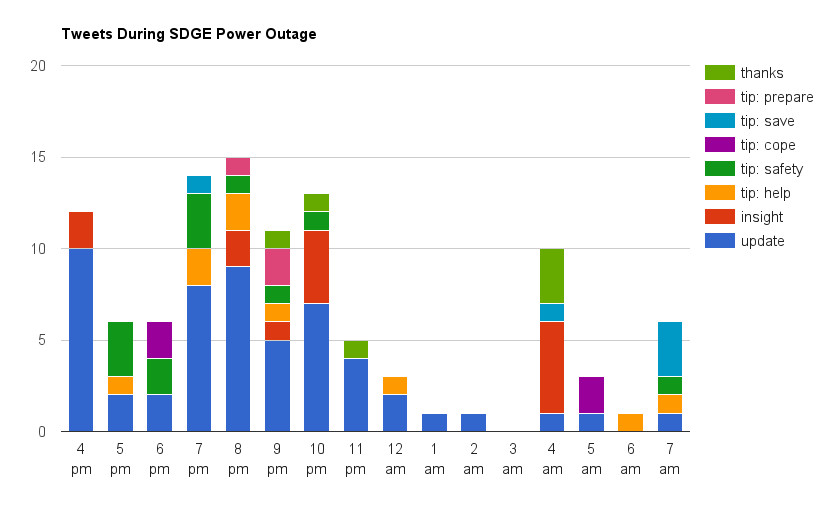
Let me demonstrate by taking a look at one of my old data stories. In 2011, I wrote a story about how San Diego Gas and Electric (SDG&E) used Twitter to communicate with 1.2 million of its customers who’d lost their power. I pulled all 107 of the company’s tweets into Google Sheets, categorized each one, and then used a pivot table to generate the following chart:
Figure 1: Original 2011 Chart
I remember how proud I was of this chart, but after reading Storytelling with Data, I can’t look at it without cringing. Evidently, I had fallen into the trap of showing the data instead of the analysis. I was more impressed with my data manipulation skills than I was in taking the time to present it well.
Knaflic explains that this is a common outcome of someone who focusses on exploratory analysis instead of explanatory analysis.
“Exploratory analysis is what you do to understand the data and figure out what might be noteworthy or interesting to highlight to others…When we’re at the point of communicating our analysis to our audience, we really want to be in the explanatory space, meaning you have a specific thing you want to explain, a specific story you want to tell…Too often, people err and think it’s okay to show exploratory analysis…It’s an understandable mistake.” 1
The paragraph hit me like a ton of bricks. I had broken a StoryHow cardinal rule: I didn’t have empathy for my audience–preferring to tell the How I got here cleverly story instead of the What the audience needs to know from my analysis story.
My original goal was to demonstrate how the majority of SDG&E’s tweets contained updates about the situation. And although Figure 1 contained that information, its Joseph and the Amazing Technicolor Dreamcoat theme camouflaged the story. I always knew that the chart had a problem when presenting it live, but I didn’t how to fix it. So, I relied on my deft hand-waving and laser-pointing skills instead.
Storytelling with Data taught me that I should have eliminated the distractions to make the visual story more conspicuous.
Figure 2: Updated Chart
By combining all of the “non-updates” and reducing the number of chart colors, the “updates” story begins to emerge.
…reduce clutter: because it makes our visuals appear more complicated than necessary.” 2
But, even though the improved chart tells a better story, it still lacked something. And so, I redesigned it to show percentages instead of the raw numbers:
Figure 3: Updated Chart with Percentages Instead of Actuals
Figure 3 now tells the story that I had failed to show graphically. It illustrates how event “updates” dominated the SDG&E Twitter feed while the power was out, then dropped off after power was restored at 3 a.m.
“This is not about oversimplifying, but rather not making things more complicated than they need to be.” 3
Storytellers must do the heavy lifting for their audiences. That responsibility requires us to remove the clutter from our stories, independent of the form that we choose to tell them, such as text, sight, or sound.
More than 70 million copies of Napoleon Hill’s Think and Grow Rich have been sold since its release in 1937. The fact that the book is still in print today is a testament to the timelessness of its message.
One of the book’s many concepts is of the “master mind,” a collection of trusted individuals that successful people assemble to bounce ideas off of. Such a group embodies the proverb, “Two heads are better than one.”
But later in the book, Hill refers to a different type of master mind–an imaginary one! He even lists the members of this imaginary cabinet:
Ralph Waldo Emerson, Essayist (1803 – 1882)
Thomas Paine, Philosopher (1737 – 1809)
Thomas Edison, Inventor (1847 – 1931)
Charles Darwin, Naturalist (1809 – 1882)
Abraham Lincoln, US President (1809 – 1865)
Luther Burbank, Horticulturist (1849 – 1926)
Napoleon Bonaparte, Emperor (1769 – 1821)
Henry Ford, Industrialist (1863 – 1947)
Andrew Carnegie, Industrialist (1835 – 1919)
And if you think that assembling a group of dead guys (sans Ford in 1937) for business conversation is strange, listen to what Hill had to say about some of these “meetings.”
Each of these nine men developed individual characteristics, which surprised me. For example, Lincoln developed the habit of always being late, then walking around in solemn parade. He always wore an expression of seriousness upon his face. Rarely did I see him smile.
That was not true of the others. Burbank and Paine often indulged in witty repartee which seemed, at times, to shock the other members of the cabinet. On one occasion Burbank was late. When he came, he was excited with enthusiasm, and explained that he had been late because of an experiment he was making, through which he hoped to be able to grow apples on any sort of tree. Paine chided him by reminding him that it was an apple which started all the trouble between man and woman. Darwin chuckled heartily as he suggested that Paine should watch out for little serpents, when he went into the forest to gather apples, as they had the habit of growing into a big snakes. Emerson observed–“No serpents, no apples,” and Napoleon remarked, “No apples, no state!”
These meetings became so realistic that I became fearful of their consequences, and discontinued them for several months. The experiences were so uncanny, I was afraid if I continued them I would lose sight of the fact that the meetings were purely experiences of my imagination.” 1
So, let’s get this straight. Napoleon Hill, one of the most successful nonfiction authors of all time, eavesdropped on conversations between famous dead people? Did he suffer from some sort of mental illness?
Maybe. But what if I told you that Hill had stumbled upon a powerful communications exercise?
I wrote my first nonfiction book as a novel. Impressed with how other books like The One Minute Managerand The Goal taught business skills through the power of story, I chose to write The Edison Effect: Success Strategies for the Information Age (1995) as a story about a manager who loses his job to technology and the lessons that he learns along the way to get back into the job market.
Writing a novel came with challenges–the largest being that I’d never written dialog before. I’d always written facts and opinion but never in the form of a conversation. When I finally attempted to write my first conversation between two characters, I experienced my own invisible cabinet moment.
My goal was to teach the reader a lesson during the course of a conversation between two characters. But that’s when something odd happened. Somehow, my two imaginary characters wrestled control of the conversation from me. I became a third-party observer, dutifully documenting the conversation like a courtroom stenographer instead of an author. My characters had taken on a life of their own in the same way Napoleon Hill described his brooding Lincoln or witty Emerson. The experience felt unsettling…perhaps even schizophrenic.
Well, at least temporarily. Periodically, I’d find myself thrust back into the writing role as I questioned one of the character’s lines.
“Tina would never say anything like that,” I’d think. “She’s a high school student and doesn’t have the knowledge nor life experience to deliver such a line.”
It was in moments like these that I’d retake the reins, delete the sentence and then wait until the character decided to say something more believable.
It’s been over twenty years since I wrote my first piece of dialog. I’m more comfortable with letting imaginary characters drive the conversation because I’ve also learned that writing dialog is a unique way to inject multiple perspectives into my writing. And the most important byproduct of writing dialog? It always reveals holes in your story, which is why you should try it.
I’ve learned that writing effective dialog requires two things:
Lots of homework. When I wrote The Edison Effect, I knew that Tina was teenager, Mr. Kemper was an old man in retirement, Barbara was an up and coming manager in her thirties, and Jake was a middle-aged guy about to lose his job to technology. By understanding the background and motivations of each character, I established believable lanes for their dialog to stay within. Napoleon Hill did the same with his invisible counselors. By studying these famous lives, he understood their thought processes, mannerisms, and wit. The more he knew about their motivations and actions, the more his Neural Story Net could invent ways for them to react in new situations.
Remain true to the character’s knowledge and motivations. There will be times when your characters say something that you’ll question. You’ll wonder, “Can they really say that? Do they have the knowledge or experience to make that statement?” If the answer to either of these questions is “No,” you must do one of two things: delete the line and wait for them to say something more consistent with their character, or revisit their backstory to give them the skill/knowledge/experience to support their statement.
I warn you. Writing dialog for the first time will be an uncomfortable experience. But the rewards are well worth it.
Write dialog. Understand your characters’ backstories so that you can establish believable dialog lanes. Place them into situations that require conversation and then sit back and see where they take it. More often than not, they’ll carry you to an unexpected place. But since these imaginary friends have been assembled as your “master mind,” they’ll likely come up with a better idea than you could have created…err…on your own. 🙂
Notes:
Napoleon Hill, Think and Grow Rich (New York: Fawcett Crest, 1960), 217-218
In the mid-1960s, Juan Trippe, CEO and founder of Pan Am wanted to double the size of his largest commercial aircraft. When Boeing accepted the challenge, Trippe placed an order for twenty-five of these imaginary planes.
Trippe wanted two things for his passengers: comfort and a convenient way to get them into and out of the aircraft. He believed that a double-decker plane–essentially stacking two Boeing 707 cabins on top of one another–was the best way to go. But Joe Sutter, Boeing’s lead engineer saw too many drawbacks with the double-decker approach. He preferred a side-by-side configuration.
Convincing the stubborn CEO to change his mind would take some work. Since Trippe and Sutter had butted heads before, Boeing decided to send the “more amiable” (Sutter’s words) Milt Heinemann to convince Trippe and Pan Am’s brass that the world’s first wide-body commercial aircraft would best fit the bill.
Heinemann opened his presentation with a layout of the twenty-foot wide main cabin. However, the drawing couldn’t convey a feeling for the cabin’s size because no one had ever experienced sitting inside a wide-body aircraft before. He needed a way to make the numbers meaningful, so he stretched a twenty-foot length of clothesline from one end of the boardroom to another, placing the execs in the middle of this vast space. It worked. Heinemann’s rope demonstration changed the course of the discussions and the Boeing 747 wide-body was born.
Milt Heinemann understood that symbols are storytelling elements that connect abstract concepts to real-world ones. Symbols provide listeners with a deep sense of comfort because of their familiarity. Few people have the ability to comprehend how scaled drawings feel in actual size, but everyone knows what it’s like to live in actual size. By using a common rope to demonstrate what twenty feet of space feels like, he transformed abstract numbers on a page into a relatable experience.
Business storytellers use symbols to convey complex ideas. What symbols can you use to better articulate your point?
One-hundred eighteen years ago, Thomas Edison experimented with moving pictures. One of his company’s first subjects? Trains. Yup, trains.
Although these silent images aren’t much to look at today, crowds reacted to them the way modern day moviegoers watch a horror film. Many flinched as they anticipated locomotives crashing through screens and into darkened playhouses.
But like all things new, eventually, they become old. The first set of trains was scary. The second set was impressive. Yet, by the time the third set came around, the larger-than-life, smoke-puffing monstrosities seemed tame.
Years ago, my friend Tim Street told me that “spectacle always precedes story.” He explained that while media-based innovations grab people’s attention, their hold dwindles with time as the novelty wears off. It happened with radio, movies, television and the Word Wide Web. It’s happening today with GoPro videos, aerial drone photography, and virtual reality with Oculus Rift and Google Cardboard.
Tim’s wisdom contains a lesson for all business storytellers. No matter how spectacular something appears today, its impact will diminish tomorrow. We can only watch so many first-person cliff dives, beautiful sunsets shot 250 feet above a waterfall or virtual reality shark cage experiences before we find ourselves wanting more.
We’ll want a story. Instead of “Freight Train,” we’ll want “The Great Train Robbery.”
Spectacle always precedes story. Salacious clickbait headlines will work until audiences tire of feeling baited & switched. And while viewers may find the untimely demise of their favorite Game of Thrones characters exhilarating, inevitably they’ll grow weary and demand something more.
Don’t be a one-trick pony. Spectacle is temporary. Story is everlasting.
Or, as in the immortal words of the Eagles, “They will never forget you ’til somebody new comes along.”