In last week’s post, How to Tell a Story with Data: Part 1, we used lessons from Cole Nussbaumer Knaflic’s book, Storytelling With Data to correct mistakes made while creating a stacked bar graph. This week, we’ll study the effectiveness of pie charts.
One of the things that struck me about SDG&E’s tweets When the Lights Went Out was the company’s preoccupation with consumer safety. For example, some of SDG&E’s safety tips included flashlight recommendations over candles, using caution while driving through dark intersections, and even checking in with elderly neighbors. I decided to tell this story by comparing the total number of tips through this pie chart.
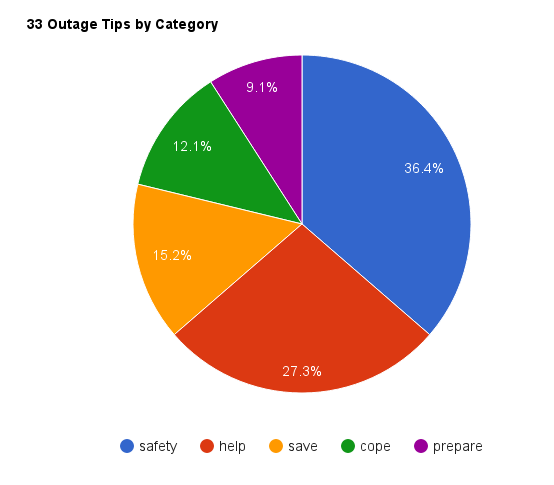
Figure 1: Original Chart
The problems with this chart seem obvious after reading Storytelling with Data. The first thing that we notice is that although SDG&E’s safety tips consume 36% of the pie chart’s area, the story doesn’t jump off the page. So, I implemented Knaflic’s “remove the clutter” technique to make the story more conspicuous.
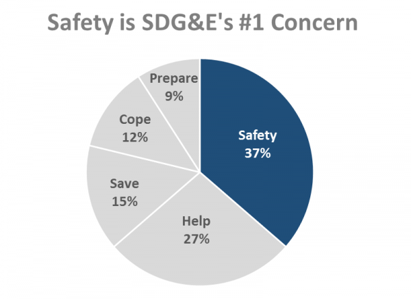
Figure 2: Better, but…
While the chart is better, it also presents us with a good news-bad news situation. The good news is that SDG&E’s safety tips now pop. The bad news is that the chart still fails to tell my “preoccupied with safety” story as the safety tips appear to play a minor role instead of a major one. So, what’s going on?
Knaflic identifies a fatal flaw with using pie charts–the fact that our brains distort the data that they represent. Because of this phenomenon, she recommends that we always present data linearly. Take a look at what happens when we present the same data from Figure 2 linearly.
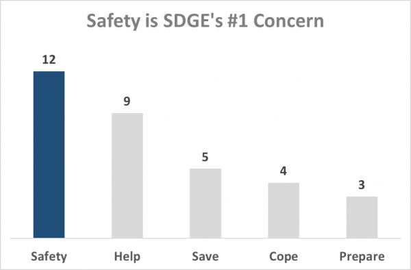
Figure 3: Data in a Linear Form
How cool is that? Simply transforming a pie chart into a bar chart makes the story jump off of the page.
The differences between Figure 2 and Figure 3 reminded me of an old Scam School video. In it, host Brian Brushwood takes advantage of our inability to evaluate round things to win bar bets. Take five minutes to watch this fun and informative demonstration.
The video clearly exhibits how round items mess with our brains, which is why Knaflic is on a mission to eradicate pie charts from the face of the earth. And she doesn’t mince words when she talks about them.
“Pie charts are evil,1” she says.
I’m convinced. How about you?
Notes:
- Cole Nussbaumer Knaflic, Storytelling with Data: a Data Visualization Guide for Business Professionals (Hoboken: Wiley, 2015), 61
Additional Resources:
- Cole Nussbaumer Knaflic is also the author of the Storytelling with Data blog