Whenever I read a good book, I always ask myself, “What single nugget can take from it?” After finishing Cole Nussbaumer Knaflic’s Storytelling With Data: A Data Visualization Guide for Business Professionals, I learned that I needed to put as much emphasis on visual editing as I do with my narrative editing. Storytelling with Data identified a flaw in my approach to telling data stories–the fact that I relied too much on my narrative skills to compensate for a deficit in my visual editing skills.
Let me demonstrate by taking a look at one of my old data stories. In 2011, I wrote a story about how San Diego Gas and Electric (SDG&E) used Twitter to communicate with 1.2 million of its customers who’d lost their power. I pulled all 107 of the company’s tweets into Google Sheets, categorized each one, and then used a pivot table to generate the following chart:
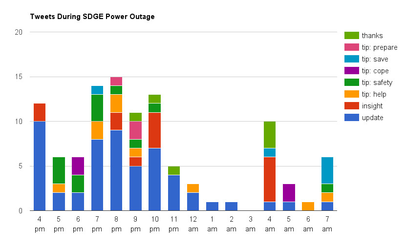
Figure 1: Original 2011 Chart
I remember how proud I was of this chart, but after reading Storytelling with Data, I can’t look at it without cringing. Evidently, I had fallen into the trap of showing the data instead of the analysis. I was more impressed with my data manipulation skills than I was in taking the time to present it well.
Knaflic explains that this is a common outcome of someone who focusses on exploratory analysis instead of explanatory analysis.
“Exploratory analysis is what you do to understand the data and figure out what might be noteworthy or interesting to highlight to others…When we’re at the point of communicating our analysis to our audience, we really want to be in the explanatory space, meaning you have a specific thing you want to explain, a specific story you want to tell…Too often, people err and think it’s okay to show exploratory analysis…It’s an understandable mistake.” 1
The paragraph hit me like a ton of bricks. I had broken a StoryHow cardinal rule: I didn’t have empathy for my audience–preferring to tell the How I got here cleverly story instead of the What the audience needs to know from my analysis story.
My original goal was to demonstrate how the majority of SDG&E’s tweets contained updates about the situation. And although Figure 1 contained that information, its Joseph and the Amazing Technicolor Dreamcoat theme camouflaged the story. I always knew that the chart had a problem when presenting it live, but I didn’t how to fix it. So, I relied on my deft hand-waving and laser-pointing skills instead.
Storytelling with Data taught me that I should have eliminated the distractions to make the visual story more conspicuous.
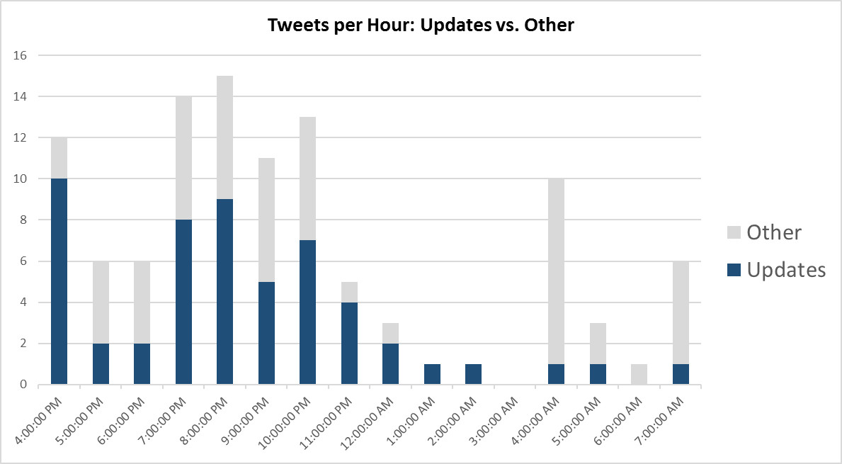
Figure 2: Updated Chart
By combining all of the “non-updates” and reducing the number of chart colors, the “updates” story begins to emerge.
…reduce clutter: because it makes our visuals appear more complicated than necessary.” 2
But, even though the improved chart tells a better story, it still lacked something. And so, I redesigned it to show percentages instead of the raw numbers:
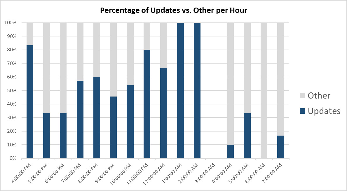
Figure 3: Updated Chart with Percentages Instead of Actuals
Figure 3 now tells the story that I had failed to show graphically. It illustrates how event “updates” dominated the SDG&E Twitter feed while the power was out, then dropped off after power was restored at 3 a.m.
“This is not about oversimplifying, but rather not making things more complicated than they need to be.” 3
Storytellers must do the heavy lifting for their audiences. That responsibility requires us to remove the clutter from our stories, independent of the form that we choose to tell them, such as text, sight, or sound.
Notes:
- Cole Nussbaumer Knaflic, Storytelling with Data: a Data Visualization Guide for Business Professionals (Hoboken: Wiley, 2015), 19-20
- Knaflic, 73
- Knaflic, 140
Additional Resources:
- Cole Nussbaumer Knaflic is also the author of the Storytelling with Data blog